DON PALERMINI PORTFOLIO
BELL HELMETS BRAND PLAN
BRAND PLAN FOR ICONIC HELMET-MAKER USES HISTORY AS TRAJECTORY
“What is Bell at its best?” THIS is the essential question we asked during an intensive brand assessment and planning project begun in 2011. Numerous management and ownership changes, competing internal priorities and transactionally focused business practices left the brand without a clear sense of direction. While still profitable, the signs of erosion became more evident as market share and brand perception slowly declined. Add an increase in competition, a fragmented internal structure and a complex distribution model to the mix and you can see why some soul searching was in order.
A small, strategic strike force assembled to delve into the brand history and DNA; identify the pinnacle moments, people, products and ideas; and translate it all into a strategic trajectory. With backing from the company’s highest level, the Bell Bran Plan was not just a marketing play, but a far-reaching blueprint to refocus, tune and revamp everything from the core mission to product development to the way business is done.
The first deliverables from the project were the Bell Shop Manual and Field Guide excerpted below. These rich collateral pieces help articulate the company's origins, identify brand truths, and point to a purposeful future trajectory. Subsequent visual guides and brand foundation documents serve as the tactical manuals for executing the plan. Finally, prescriptive industrial design language guidelines were put into place to drive product creation.
THE PLAN COMES TOGETHER - The Bell Shop Manual and Field Guide both articulates the brand plan and serves as the visual archetype for other collateral. Despite being drafted in 2011, the design language and brand ethic is still in use and evident in the marketplace and the culture.
USING HEROES TO HERO THE PRODUCT
Before we called them influencers, there were guys like Aaron Gwinn. A five-time world cup champion in downhill mountain biking, Bell used the sponsored athlete as the prototype for a distinctive brand hero presented in keeping with tradition but with fresh framing.
As an American with a motocross background who trained under the auspices of all-time Bell great John Tomac, Aaron represented the perfect storm of brand-right attributes. Not only was he made the focus of Bell’s mountain bike marketing, but his technical acumen helped design and bring a new, ground-breaking helmet to market.
By putting Aaron front-and-center and leveraging him everywhere—in-store, online, in-person, in advertising and collateral, on t-shirts and swag—the team reestablished Bell at the top of the mountain.

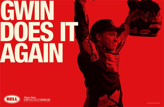
SWAG WITH SWAGGER - A limited edition poster and t-shirt feting Aaron's first World Cup title became a much sought piece of swag by shop employees and industry types. As he added titles two, three, four and five in subsequent years, the pieces' value soared.

LIVING THE LOOK - Aaron became the face of Bell in mountain bike — everything about him embodies the brand. In everything from marketing presentations (above) to heritage videos (forthcoming), the humble yet capable Gwin is a comfortable fit. The aesthetic was also distinctive and portable to other segments...motocross, auto racing, etc.

DISTINCTIVE AND OWNABLE - Race win ads are often a picture and a logo, but the graphic devices established as part of this project made distinctively Bell collateral seamless and easy-to-produce.

LOOMING LARGE - The distinctive new Bell aesthetic is a tasteful update of the brand's original graphic stylings that really brings a room together...or a trade show hall, as the case may be.

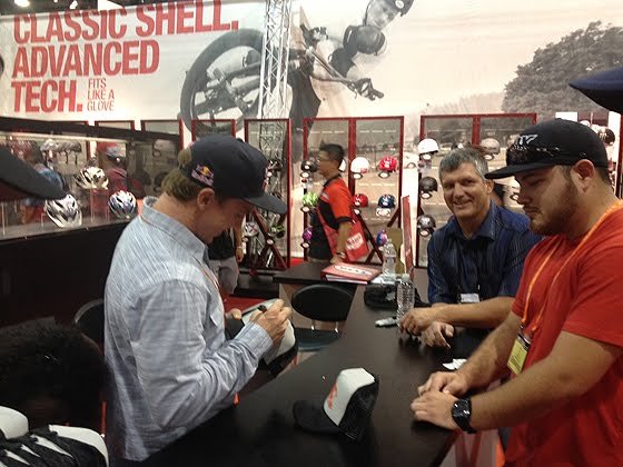
THE PERSONAL TOUCH - Despite digital experiences improving dramatically since the launch of this plan in 2011, making a human connection (especially in a post-pandemic world) is one of the more impactful thing a brand can provide for its customers.

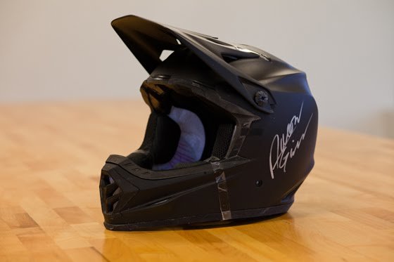
MORE THAN A SIGNATURE - Aaron's product development contributions were fundamental to the design of the Full 9 helmet. There's probably something to be said for actual authenticity here, but the product speaks for itself.
CULTURAL CURATION AS BRAND EXPRESSION
Before we called them influencers, there were guys like Aaron Gwinn. A five-time world cup champion in downhill mountain biking, Bell used the sponsored athlete as the prototype for a distinctive brand hero presented in keeping with tradition but with fresh framing.
As an American with a motocross background who trained under the auspices of all-time Bell great John Tomac, Aaron represented the perfect storm of brand-right attributes. Not only was he made the focus of Bell’s mountain bike marketing, but his technical acumen helped design and bring a new, ground-breaking helmet to market.
By putting Aaron front-and-center and leveraging him everywhere—in-store, online, in-person, in advertising and collateral, on t-shirts and swag—the team reestablished Bell at the top of the mountain.
STAY GOLD (WHETHER YOU WANT TO OR NOT) - Though a bit dated in some ways, this video featured a real-life first place trophy as the hook for a helmet art collaboration with pinstripe artist Skratch and pin-up model Cherry Dollface.

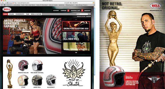
NOT RETRO. ORIGINAL. - From product graphic themselves to touch points across the marketing spectrum to from digital to print to in-store and at events, the culture and lifestyle story exemplified by artist and builder Skratch emphasized the originality story of the Bell 500 throwback helmet.

SKRATCHING THE ITCH - In-person appearances at events, trade shows and key retailers by artist/builder Skratch lent legitimacy to the Custom 500 helmet story and endeared customers to the brand.
EVANGELIZING A DISTINCT POINT-OF-VIEW
When you can swap a logo from one advert to another and nobody knows the difference, have you created anything memorable? Good brands use all the senses to build a distinctive and differentiated experience that’s true both to their company’s character as well as the audience they aspire to attract.
Of all the cycling disciplines, road racing has the most uniform aesthetic. Supermodel emaciation, skin-tight togs, and militarily regimented tactics and rules make for a very homogenous presentation. Save for the aligning with a generational break-through personality or two, how does one make a brand play that doesn’t just feel like everyone else’s?
For Bell, we chose to look at road cycling through the rough and gritty lens from which it was spawned. Unlike the Tour de France, which has a sanitized vibe, the Spring Classics are some of the hardest single-day athletic events on the planet conducted on Europe’s worst roads in often epically bad weather. In other words, perfect for Bell. We leaned in with The Hard Road.
spacer
SPACER


